

Colour Palettes For Romantic Brands
Colour palettes are essential to any branding process. Colour psychology is a powerful tool for creating brands that stand out from the competition. By understanding how colour affects the human mind, you can create a brand that resonates with your target audience and captivates their attention!
Valentine's Day is just around the corner, and that means that now is the perfect time to start thinking about incorporating romance into your brand! But when it comes to creating a romantic brand, which colours should you use? Let’s explore some of the most romantic colour palettes out there.
THE PASSIONATE
RED PALETTE
When considering a romantic colour scheme, nothing is quite as iconic and eye-catching as the colour red. Red is passionate and intense; it symbolises love, power, and danger. The intensity of this hue can be quite captivating; it draws attention and brings dynamism to any setting. Red has been seen throughout history as having a special significance when it comes to love, from ancient mythologies all the way up to present day customs.
Not only does it add vibrancy and energy to whatever setting it's placed in, but also stands out amongst other colours for its passionate symbolism. When used in branding or design, red should be employed sparingly as too much of it can be overwhelming and take away from the desired effect.
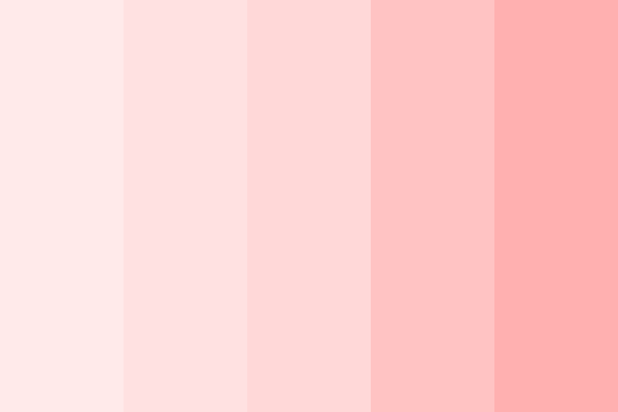
THE RED-PINK-WHITE PALETTE
This colour palette is one of the most popular romantic palettes out there. It consists of bright red, soft pinks, and snow white shades. This aesthetic will give your brand an energetic, passionate feel. The combination of colours will help create an air of confidence and strength while still conveying messages of love and intimacy. You should also consider adding accents of black or white for added depth and contrast.


THE FEMININE
PINK PALETTE
Pink evokes feelings of tenderness and affectionate love. It represents femininity, youthfulness, innocence, sweetness—all qualities that are associated with romance. Pink is often seen as a softer version of red but still has the same desired effects when used correctly in branding. Use pink sparingly alongside other colours to create a soft yet inviting look for your brand.
THE SOFT PINK-BLUE-WHITE PALETTE
This playful palette will give your brand an innocent yet sophisticated feel that is sure to capture everyone’s attention this Valentine’s Day season. The combination of gentle pinks, calming blues, and bright whites will make your audience feel as though they have stepped into a dreamy world filled with love and romance. This colour scheme works particularly well if you are targeting audiences who may want to indulge in their playful sides this holiday season.
THE ROYAL
PURPLE PALETTE
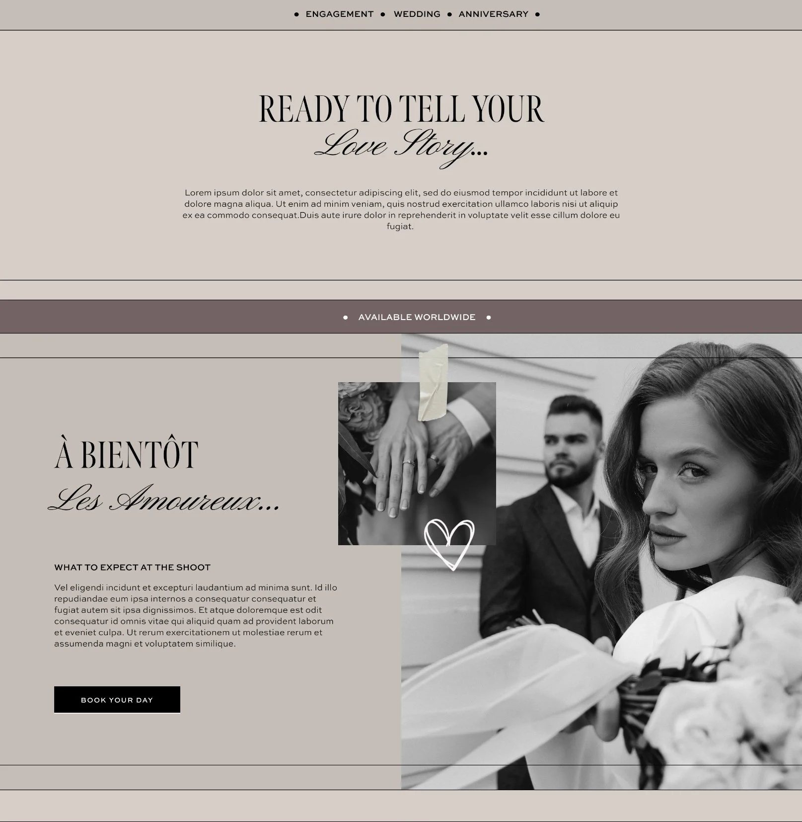
MON AMOUR WEBSITE TEMPLATE
The colour purple symbolises luxury and royalty; it is often associated with wealth and power – perfect for giving your brand a touch of elegance! Purple pairs well with other shades like pink or black & white; however, be sure not to overuse purple as too much can have an overwhelming effect.
THE PURPLE-LAVENDER-WHITE PALETTE
This luxurious palette will make your brand look like it has been plucked straight from a fairytale romance novel. The combination of royal purples, lavender hues, and whites evoke feelings of elegance and sophistication in your audience. This palette works especially well if you are targeting luxury markets.
THE CLASSIC
BLACK + WHITE PALETTE
Black and white evokes images of sophistication and timelessness – perfect for creating a classic romantic aesthetic reminiscent of Old Hollywood Romance! —Imagine Humphrey Bogart and Ingrid Bergman in Casablanca, for example. Although these two hues work well together alone (think black tuxedo paired with a white dress), they also pair nicely with other colours such as pink or purple for even more impactful visuals.
Creating a romantic brand doesn't have to be complicated—whether you want to evoke feelings of love or luxury this Valentine’s Day season, there are plenty of ways you can incorporate romance into your brand through colour palettes.
Reds bring energy while pinks evoke tenderness; classic blacks & whites represent timelessness and purples portray royalty. Incorporating shades of pink paired with either red tones or purples will instantly set the tone for a passionate ambiance that will make anyone fall in love at first sight.
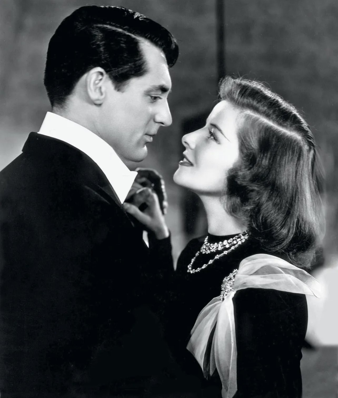
KATHERINE HEPBURN & CARY GRANT, HOLIDAY (1938)
So what are you waiting for? Start brainstorming today and with the right combination of hues, you can create a beautiful palette that will capture hearts all season long! Keep these tips in mind when designing your next branding project — you won’t regret it.