
Why every website should be responsive
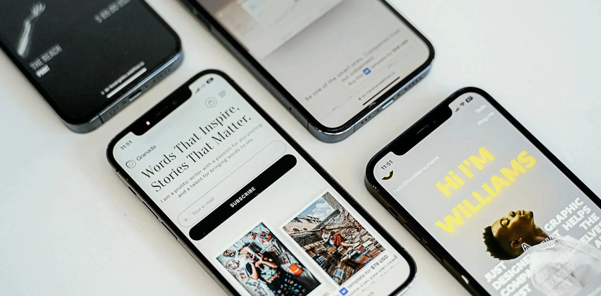
Photo by Unsplash
Have you ever opened a website on your phone, only to find yourself zooming in just to read the text? Or maybe the buttons were too small to tap, or half the page disappeared off the screen.
It only takes a few seconds for someone to decide whether to stay on your website or leave, and if your website doesn't work properly on different devices, you could be losing potential customers without even realising it.
That's why responsive website design is so important.
What is responsive website design?
A responsive website automatically adjusts to fit the screen it's being viewed on, whether that's a desktop computer, laptop, tablet or mobile phone.
Instead of creating separate versions of your website for different devices, one responsive website adapts its layout so everything is easy to read, navigate and use.
So, why does responsive design matter? Let’s look at some of the biggest benefits:
Better user experience (UX)
One of the biggest benefits of responsive website design is creating a better experience for your visitors.
More people are browsing websites on their phones than ever before. In recent years, mobile devices have overtaken desktops as the main way people access the internet worldwide. With people accessing websites via desktops, tablets, smartphones and even their smart TVs, websites have to work well across all devices.
A responsive website makes it easier for visitors to read your content, click buttons and find the information they're looking for. They won't need to zoom in, scroll sideways or struggle to use your website.
A better experience also makes people more likely to stay on your website for longer. In fact, 88% of online shoppers said they wouldn’t return to a website after having a poor experience.
Boost online visibility
A responsive website doesn't just benefit your visitors — it can also help people find your business online.
Google recommends responsive website design because it creates a better experience for users. While good rankings depend on lots of different factors, having a website that's mobile-friendly is one of the things Google looks for when deciding which websites to show in search results.
If your website is easy to use on any device, you're giving your business a better chance of appearing in search results.
Easy website management
Responsive website design can also make life easier behind the scenes. Having one website that works across every device is much easier than trying to manage different versions.
You only need to update your content once, and those changes appear everywhere. That saves time and helps keep your website up to date. For small businesses, that's one less thing to worry about, phew!
The good news is that Squarespace handles the responsive side of your website for you, so your content is ready to look great across different devices - and that’s why we recommend it.
Built for the future
It’s important that your website not only works for your business today, but continues supporting you in the future.
Responsive design helps your website adapt as technology changes, so you don’t need to rebuild it every time people start using new devices or screen sizes.
This gives you peace of mind that your website can continue providing a great experience for visitors as your business grows.
***********************
Are you ready to create your Squarespace website? Explore our collection of Squarespace templates or get in touch about a custom design.